Version 2
This gives a quick overview of the sources and methods used to create Gapminder’s dataset behind our Income Mountains, with data for the period 1800 to 2040. This dataset is used all across the book Factfulness for all graphs with household income on the x-axis.
Access the data (and more documentation) in this online spreadsheet », or download the Excel file »
(This document was written by Ola Rosling between September 2017 and April 2018, and it’s still very much in “draft mode” because of time scarcity. If you have questions, please ask them in our Feedback Forum. )
The mountains show number of people on different incomes, measured as mean household income (or consumption) per person per day, in dollars adjusted for inflation over time and price differences in year 2011 (PPP 2011). The global curve is constructed by stacking all countries bell-curves on top each other. Each country’s bell-curve is drawn using three numbers: 1. Mean income which determines where the curve is positioned on the x-axis; 2. Gini: Which determines the width of the curve, 3. Population: determining the height of the curve. The World Bank has data for Ginis and Income for countries for the year 2013 in their income database called PovcalNet, which they use for estimating the number of people in extreme poverty line. In addition to the years when PovcalNet has data, Gapminder has gathered data from a wide range of historic sources as documented for each of the three indicators in each of the latest versions of our datasets for: Gini v2, Household Income v1 and Population v5. Conceptually the average global household income should be the same as the global GDP per capita, but they are a bit different, and the reasons are outlined here.
The trend beyond 2016 into the future, is hypothetical. It was generated only to show a likely “IF-scenario”, how peoples incomes would change if assuming the world’s countries continued having a modest version of their recent economic growth and inequalities in each country remain as in 2013. These assumption are not meant to say that’s gonna happen. Nobody can know. Instead they are useful only to see what the world would look like IF that would happen, which might be quite likely. The growth forecast of income is documented on the GDP per capita documentation page ».
The trends of mean household income per capita is using the growth rates form our dataset for GDP per capita GDP per capita version 25, to estimate the levels of income backwards to year 1800. The Income trends are extended into the future with the modest future growth rates of the GDP series, based on IMF’s growth rates for countries up to 2020 and then all countries converging to a modest global growth of 2.2%. It’s worth noting that this is a highly hypothetical forecast, and the future picture would change a lot, depending primarily on what happens in the largest countries.
The uncertainty of this data is large. (We hope in the future to be able to visualise the doubt we have as a blurred outer border of the shape to remind users of the high uncertainty.) We still dared to compile a consistent dataset and fill in all the gaps even if the uncertainty is high. Because the ignorance of global development is even higher. We believe that we can change that ignorance by showing visually what it looked like when billions of people left extreme poverty behind. For such image to be easy to understand, we can not let the image flicker because of missing data. Without clear visual impressions like our animating income mountains, we know that people instead end up imagining a world that has only changed a little bit. Or they might even imagining the majority still being stuck in extreme poverty, and thinking the world is still as bad as it always was (see the destiny instinct).
Quick description of the method
- Step 1. We use three data points for every country and year: Population, GDP per capita and Gini (Gini expresses how skewed the distribution is within a population; See wikipedia).
- Step 2. We assume the income distribution is lognormal in every country and year. This means the population pile up like a bell curve on a logarithmic scale. This assumption is not just ours. It’s surprisingly solid when compared to empirical data.
- Step 3. We draw the bell curve for every country on a global logarithmic income scale. The width of the curve depends on the Gini and horizontal position depends on the household per capita income. The sizes of the different bell curves are relative to population.
- Step 4.We pile the shapes of the country-bell-curves on top of each other for each region, and then we pile all the regions together and we have aggregated a single global shape showing where people are on different income levels.
Based on other’s ideas
We didn’t invent this way of visualising global income differences. Our income mountains are simply animating clones of static graphs in papers from leading researchers in Economic History. We first saw these kind of graphs in 2002 in this paper by Xavier Sala-i-Martín: The Disturbing “Rise” of Global Income Inequality. Page 26 (in constant PPP 1996 $). These graphs go back to 1970.

Bas van Leeuwen shared his formulas with us and explained how to the math from ginis and mean income, to accumulated distribution shapes on a logarithmic scale. The formulas we use are the same as he used when writing this paper with van Zanden “The changing shape of Global Inequality – exploring a new dataset” The graphs on page 47 shows the great escape out of extreme poverty between 1820 to 2000 like this (incomes are expressed in constant PPP 2005 PPP Dollars):
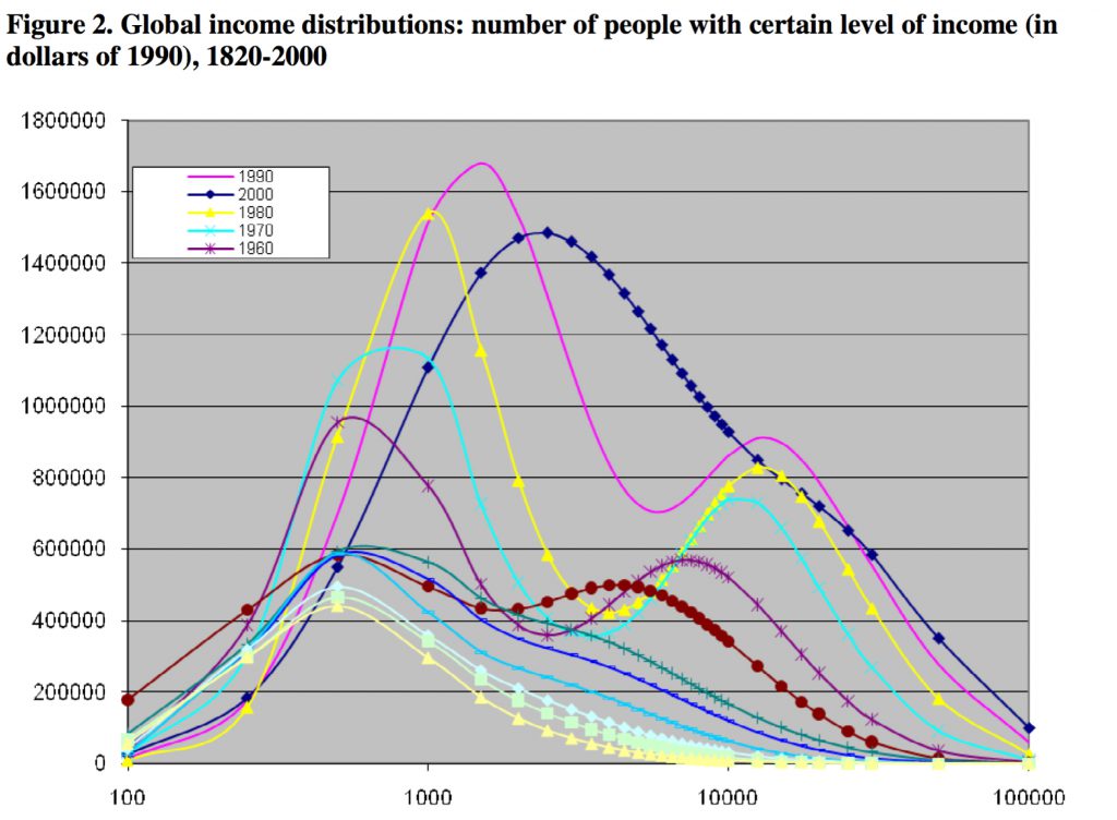
The paper describes the existence of “divided world” as a temporary phase in world history, with these words: “It also appears that the global income distribution was uni-modal in the 19th century, became increasingly bi-modal between 1910 and 1970 with two world wars, a depression and de-globalization, and was suddenly transformed back into a uni-modal distribution between 1980 and 2000.”
These graphs inspired us many years ago, and they also used Income, Gini & Population to estimate each countries distribution. Almost exactly the method we use, which describe in more detail below. One difference though is the horisontal positing of the complete curve on the income scale: Our income estimates uses PPP 2011 dollars, just like the World Bank uses for it’s estimates of extreme poverty rates, which is basically the left end of the curve, the share below $2 per day. Instead we used more recent charts as reference, to make sure our curves are horizontally aligned correctly on the income scale.

This set of graphs come from the paper “Global Income Distribution: From the Fall of the Berlin Wall to the Great Recession” by Christoph Lakner and Branko Milanovic. Despite being very similar to the curves we saw earlier, these curves are not based on mean income and gini. Instead they are the first global curves published which are based on actual income surveys and they use dollars in PPP 2011 for the x-axis, which is the same as our income data. They only cover year 1988 to 2008 because the period with good enough income data is shorter. We use these charts as our reference and we have adjusted our method to make sure our curves are as similar as possible to these, even if we generate ours form ginis and incomes.
As this latest set of graphs are based on actual income records, we consider them the “visual gold standard” for this kind of visualisation of the world population. We have adjusted our model for calculation to align visually with the chart of 2008 above. There’s just one problem. Despite the title saying “Global Distribution”, they actually show only 90% of humanity (see page 5 in the paper). And the 10% missing are primarily on middle or lower incomes. We have added all people and roughly guesstimated all countries inequalities, so that our graphs show 100% of humanity, to make sure our users don’t confuse missing data for a dip in the curve.
The primary data collected form households is of-course preferable. But it only exists for a sort period of time, and it wouldn’t klet us go back in history far. Neither would it let us extrapolate into the future. In April 2015, a working paper was published which does just that, from PIIE “The Future of Worldwide Income Distribution” written by Tomas Hellebrandt and Paolo Mauro (Working Paper15-7). On page 7 they describe how they took the recent data from PovcalNet and generate projections into the future to 2035. (Almost exactly like we did to extrapolate up to 2040, except we used a slightly more modest economic growth rate for income.) They also assume a lognormal distribution of population like the papers above.

Their curves look very different because, for some unclear reason, they decided to plot it on a linear scale linear x-axis (despite the assumption mentioned above that people are usually distributed along a normal distribution on a logarithmic scale, which is what log-normal means.). The amount of people on higher incomes in this graph also seem way too high and this is a bit misleading. Fortunately they share their data, so we can help find the problem. They have generated the line by adding up the number of people within incomes brackets. But as they sum people on higher incomes, they increase the bracket size. The first two bracket, e.g. are 10 dollars wide. Summing people on incomes 10 to 20. While if you look at richer brackets they are 50 dollars wide, and people on even higher incomes are summed in brackets that are 500 incomes high. If a graph like this is plotted on a linear scale, it should use same size brackets (or be very explicit about the brackets changing size.). All the other charts above, and Gapminder’s, use exponentially increasing brackets plotted on logarithmic x-axis.
Details in our method (DRAFTY DOCUMENTATION)
Aligning to the PovcalNet data
The standard assumption of perfect log-normality is a highly mathematical assumption. Reality is far less standardised. Two countries with the same gini can have very different shapes of their curves, in reality. So we decided to test the assumption of log-normality against PovcalNet data, to see how well the two were aligned. We found that the share of humanity in extreme poverty, for example, differed by 2.5% when using LogNormal assumption on PovcalNet’s own incomes and ginis, compared to using the actual income records in PovcalNet, for 2013.
| Globally | Extreme poverty
<$1.9 |
Level 1
<$2 |
Level 2
$2 – $8 |
Level 3
$8 – $32 |
Level 4 and above
> $32/day |
| PovcalNet | 10.7% | 12.0% | 48.2% | 27.6% | 12.2% |
| LogNormal | 13.2% | 14.6% | 45.8% | 28.1% | 11.4% |
| Difference | 2.5% | 2.6% | -2.4% | 0.5% | -0.8% |
It might seem like a small thing: 2.5%, but it’s big when talking about reducing extreme poverty rate form 10.7 %. The reason for this difference is that the distribution of people in the survey results is not actually exactly following the mathematical model for log normal distributions (why would it?). To make sure we don’t visualise too many people on the wrong income level, just because we obey a mathematical formula, we decided to find a work around, without having access to the primary records. We made the same kind of comparison by our four regions and found that LogNormal assumption would put 5% more Africans in extreme poverty, than Poval estimates. And Indias rural population was ending up on too high incomes than they have in PovcalNet.
So we decided to see if there was a better assumption than log-normal, that would align better with PovcalNet, and we invented LogNormal-topping.We generate estimates for the same people in three different ways. The numbers below compares the the estimates of people in Extreme poverty (below $1.9) and for each of Gapminder’s four income levels. First: PovcalNet data; Second: Log-normal assumption. And third: Something we call log-normal-topping. Instead of using a single logNormal distribution we use two. We split the population in two halves and spread the first half with a bit wider log normal distribution at the bottom and a bit more narrow LogNormal curve on the. Which gives us a bell-curve that has a bit more sharp peak on top of a wider bottom. The adjusted are so small they are barely visible, but the effect of adjusting the log-normal tail into poverty in every African country, now makes the African shape aligned better(32.1%) with the income records in PovcalNet(32%), compared to the standard LogNormal assumption (36.9%).
(What I’m saying is that anyone who generates plain LogNormal curves for African countries, based on PovcalNet ginis and incomes, will end up putting a total of 4.9% of Africas population into extreme poverty, where PovcalNets income records do not put them. By making a simple adjustments to the logNormal assumption about the shape of the distribution this difference disappear. The fact that you have read this far makes me think that you are interested, and if you need further documentation on my method, please ping me, and I’d be happy to explain the details, please ask for this on the Gapminder Data Forum, I would love to see a proper scientific study about this, which could either show that I made some mistake, or that there is a better way to achieve this adjustment. 🙂 Ola )
China and India’s rural and urban population, and we ended up customizing the toppings until we removed the discrepancy against PovcalNet. The difference between the LogNormal and LogNormalTopping for regions and China and India can be found in this table here.
Dealing with Rural & Urban population changing over time
In the cases of China, India & Indonesia we use PovcalNet’s data for rural and urban populations. The curves for these countries are created by combining two shapes, one for urban (grey here) stacked on the rural (yellow) (Each of these shapes are using LogNormalTopping, but as you see the difference form LogNormal is so small, you can’t recognise it with your eyes. ).

Historically most people in China and India were rural. The separation into two groups must therefor change it’s proportions and in the best case use historic data for the changing distributions within each, but we don’t have such estimates. So this problem of changing historic composition of rural and urban, is solved by “smoothing them out” when moving back in history. To solve this, in the case of China, for example, we blend from plotting a single China shape in 1800 to combining two shapes (urban & rural) in 2013 and beyond, by adjusting the historic population sizes, of these “three Chinese populations” in our input data file to look like this:
 You can also follow us on Facebook or Twitter where we keep posting about all our updates.
If you got questions about our data please use the Gapminder Data Forum.